According to Bear, J H (n.d) , there are three (3) types of balance which is symmetrical, asymmetrical and radical.
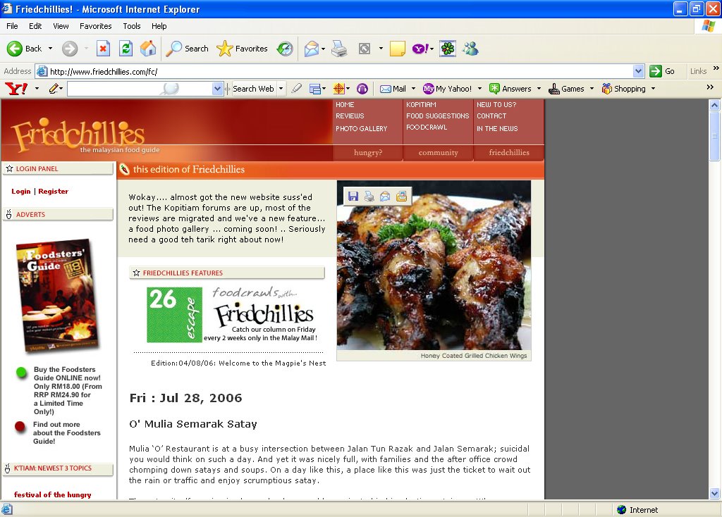
In Friedchillies, I find that the page has an asymmetrical design. As you can see from the picture above, the page has a black space on the right. At one glance, the space is a little distracting.
Reep, D C (1997) stated points on visual "weight" that we must remember
- Big weighs more than small
- Dark weighs more than light
- Color weighs more than black and white
- Unusual shapes weigh more than simple circles or squares
Besides the dark space on the right, the other part of the page is great. The navigations on how to contact the author, gallery and the discussion board are all situated at the top of the page with red background.
The left side of the page is dedicated to their recent postings and also the archives in red and white background.
The center is the review. The review is not full unless you click the word "More" at the bottom of the review entry. When clicked, the full review is shown and there will be pictures at the bottom. The pictures are of the same size and in order thus it did not create any imbalance to the entry.
No comments:
Post a Comment